Establishing God's grand design for Relationships and Marriage.
90K+
Followers
Role
Brand Identity Designer
Focus Areas
Brand Identity Design, UX/UI Design
Location
Nigeria
Website
The challenge
Relationship & Marriage Outreach also known as R&M, focuses on establishing God's grand design for Relationships and Marriage. They teach in simple and clear manner, the profound wisdom of God.
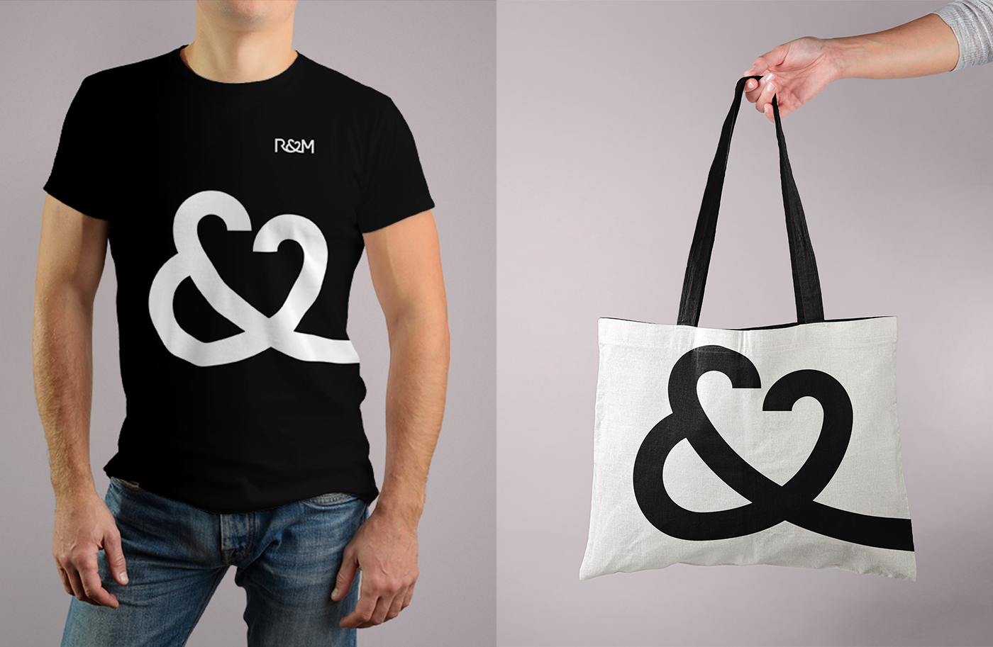
After 6 years of operation, since it's inception in 2015, R&M needed a new identity to reflect what it stands for. Also the R&M logo needed to be made adaptable throughout it's touch points.
The solution
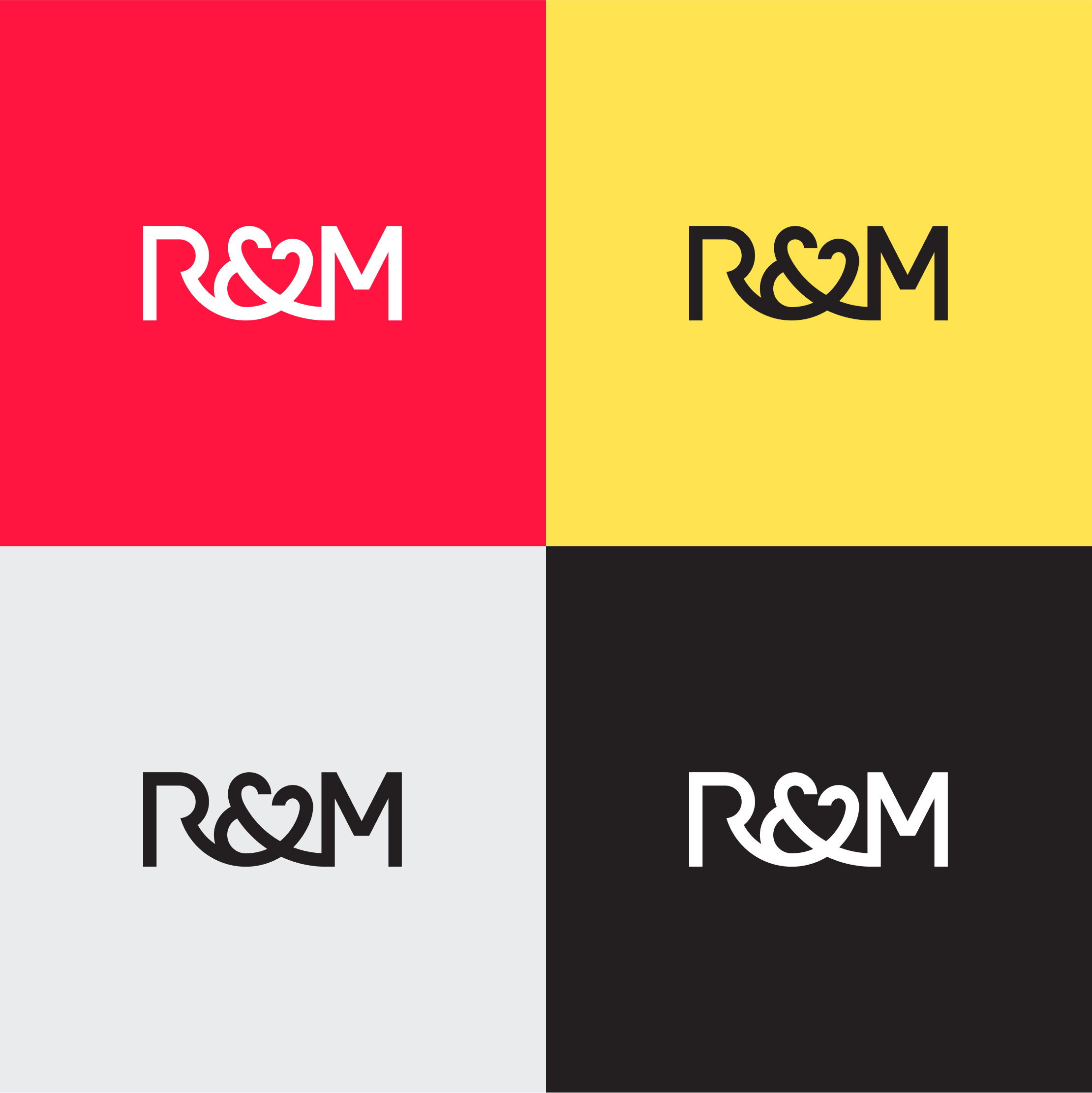
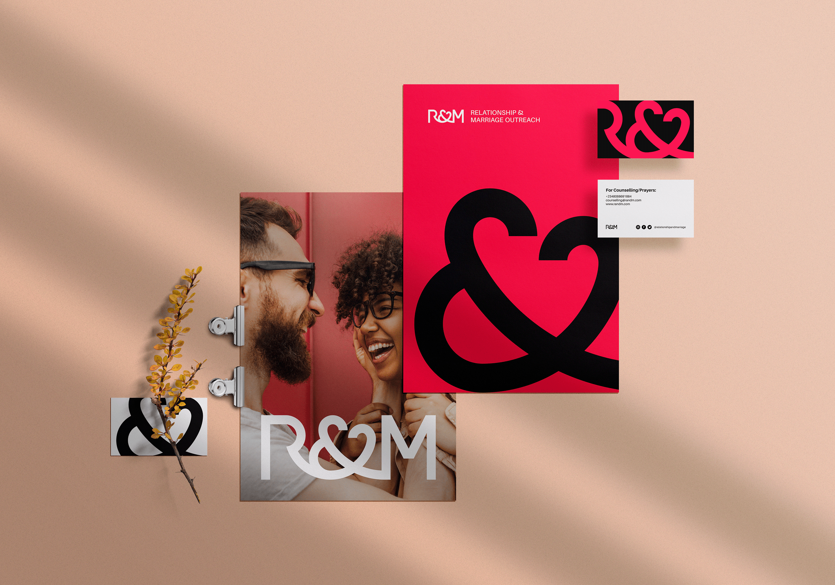
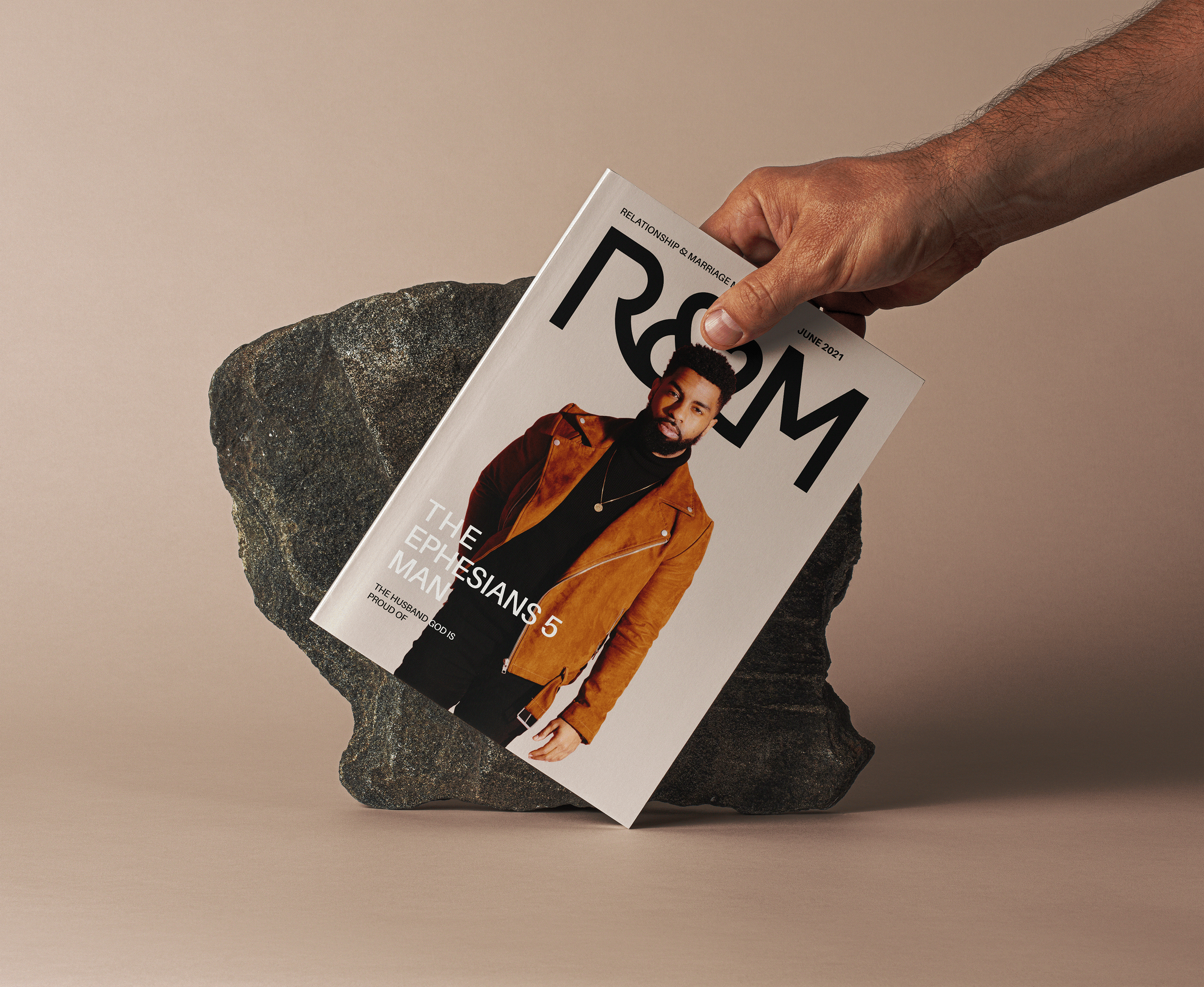
An identity around letters R, and M connected together by the ampersand symbol was crafted.


Love. Commitment. Continuity.
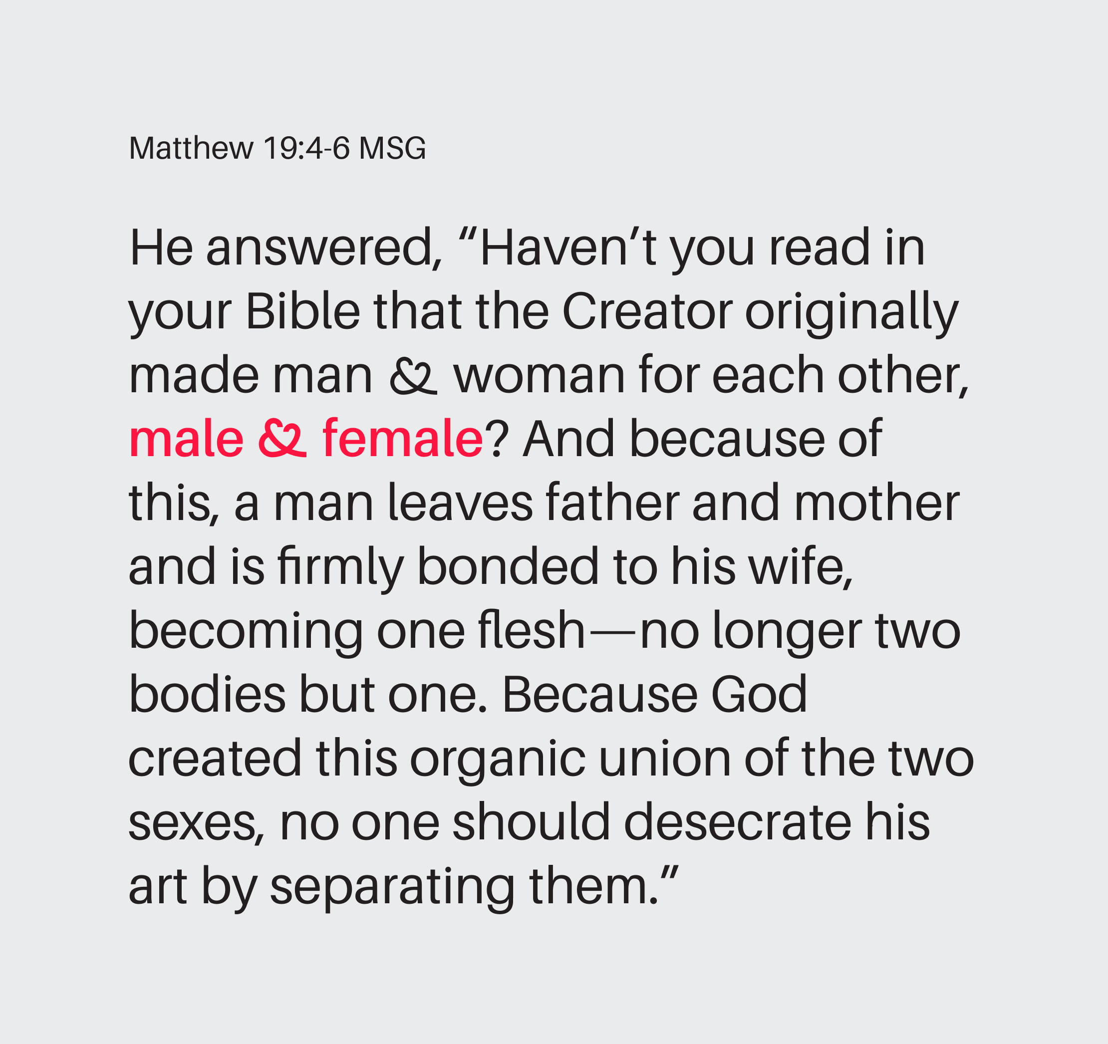
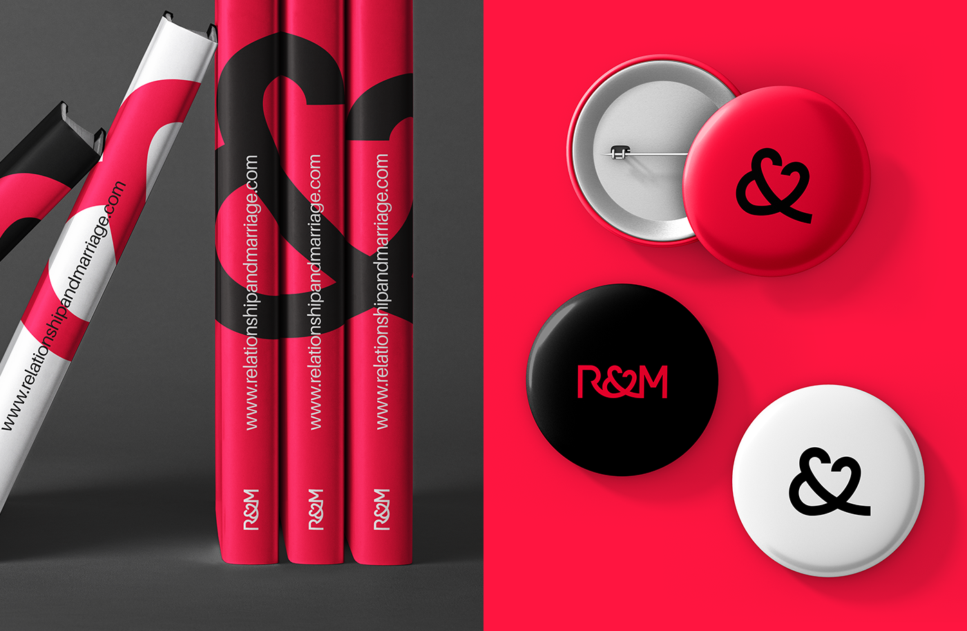
The ampersand (&) is creatively crafted to incorporate a love symbol in it and also doubles as a unique icon for the Relationship & Marriage brand. It subtly reflects a "Man" and a "Woman" connected and forming a love arc (See Img. 1 and Img. 2). The arcs flow into each other forming a single symbol, reflect commitment and oneness, giving a nod to the scripture "The two shall become one flesh". The tail end of the symbol is an extension reflecting continuity.
Keywords: Love, Oneness, Commitment, Continuity, Connection, Family

