Automatically organize your personal digital spaces.
10,000+
Users on Chrome
Role
Product Designer
Brand Identity Designer
Focus Areas
Brand Identity, UX/UI Design
Location
United States
Website
The challenge
Baxter strives to build simple, intuitive tools that help everyday folks live and work with less stress and more efficiency. Right now, Baxter organizes Gmail inboxes, but we're excited by the many potential directions we see for Baxter to go and evolve.
Baxter recognized that our digital spaces are messy and stressful to navigate. They also found out that pandemic-accelerated email overwhelm is pervasive, most consumers have files scattered over at least 3 cloud storage services, and less than 10% of consumers use email folders, though they are more efficient than search.
The solution
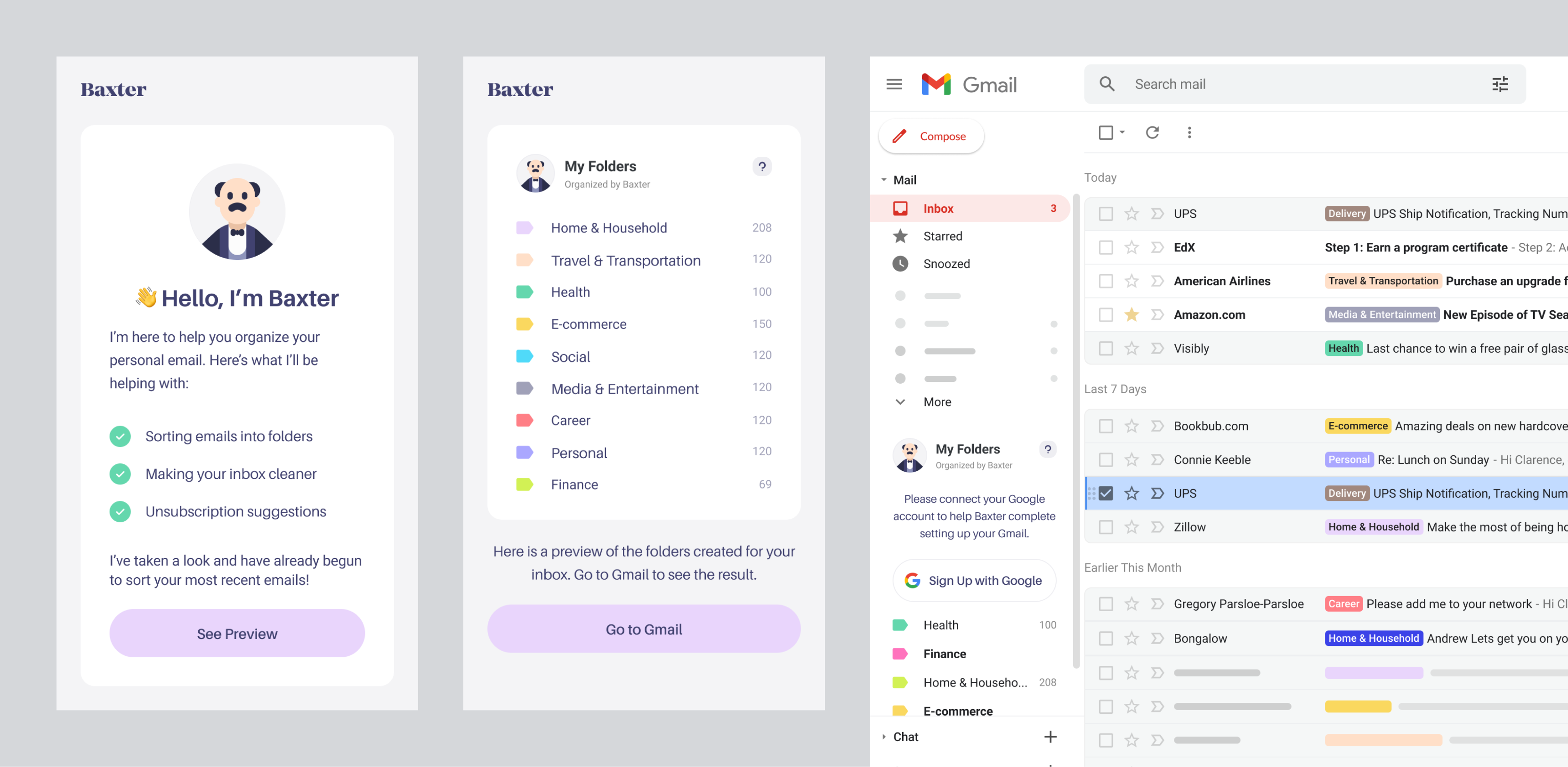
Along side a website and an MVP of the Chrome browser application, I designed the identity for Baxter.


Baxter's website.
Baxter's website is one of its touchpoint order than the Chrome extension. It needed to clearly convey what Baxter does to its users.


Result.
After 2 months of close collaboration and teamwork, the visual identity and mascot for Baxter was successfully created. Their Google Chrome extension was launched thereafter.


